August 2024: Timelog details redesign, Personal and Kiosk app redesign, and more
This month we've redesigned and added new functionality to the timelog details section in Web App. We've also redesigned the employee timelogs section in Admin App. Next, various sections of Personal App and Kiosk App have been redesigned and incorporated new functionality. Other minor improvements have been made too.
Web App
Timelog details
Timelog details have been fully redesigned and updated with some new functionality. We’ve added navigation at the top to switch to the next or previous timelog in the list. In addition, punch details are not shown per entry but are visible on the same screen.
Next, a new Map tab has been added showing punch-in and punch-out locations of the timelog. The locations are not grouped by entries but are shown together. The Map tab is visible only if at least one location is available.
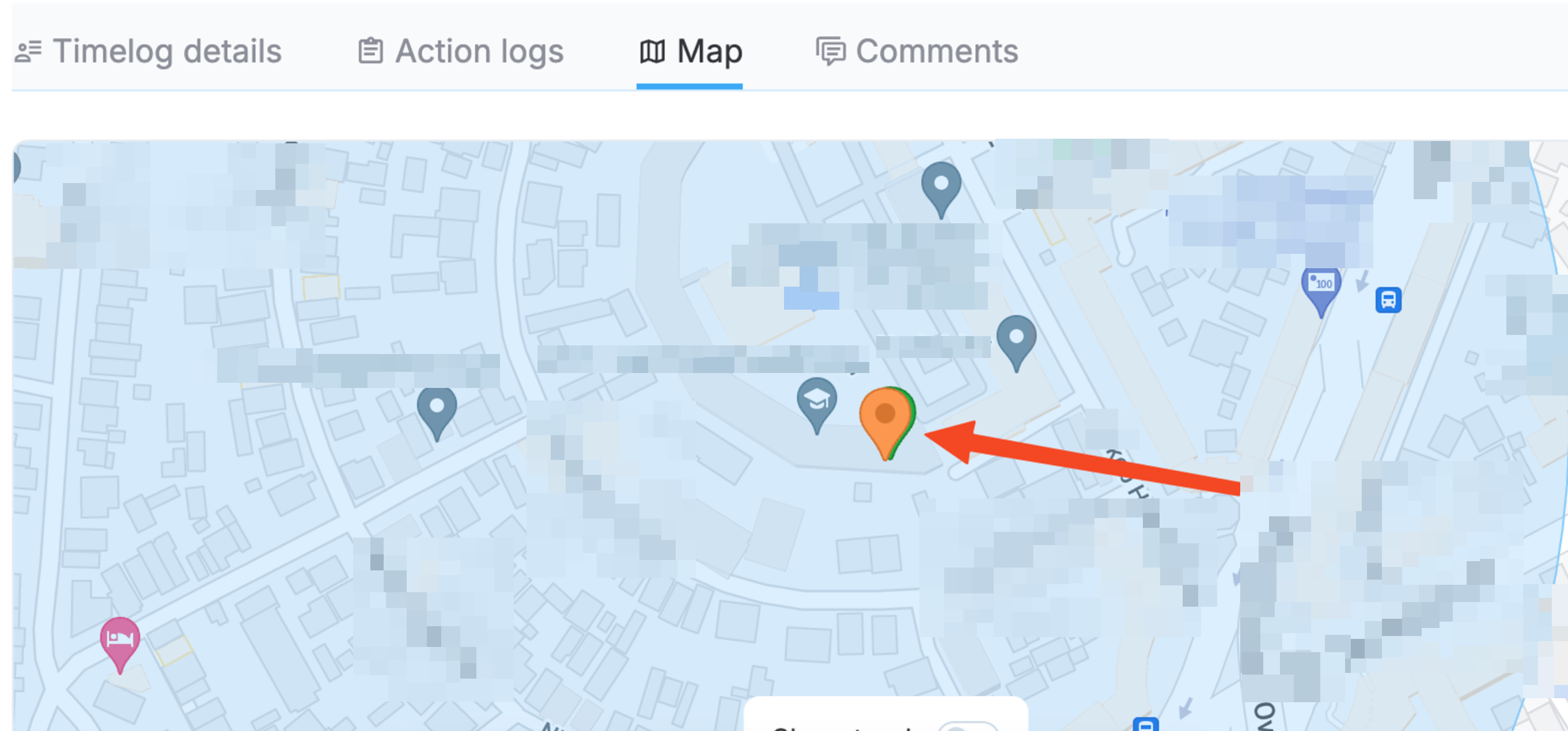
Map tab with punch locations
For split timelogs, you can now click on Split to see the job sites where the timelog has been split and navigate to the corresponding timelog details.

Viewing split job sites
You also see the job sites that the employee has switched to or from if that’s the case.
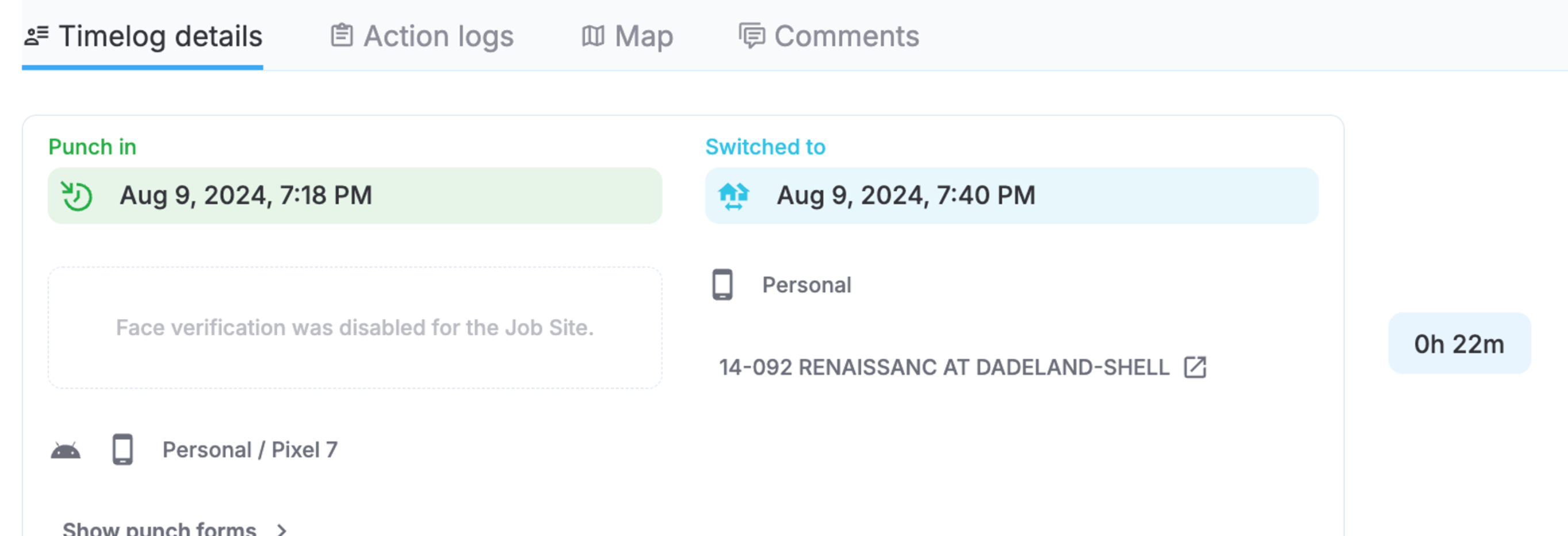
Switched job site
Other updates and improvements include
- Redesign and improvement of the Add to face templates functionality
- Ability to view leave requests in punch details
- Action logs tab content and UI/UX improvements
- Comments tab redesign
Profile info
Profile info and password change sections have been redesigned.
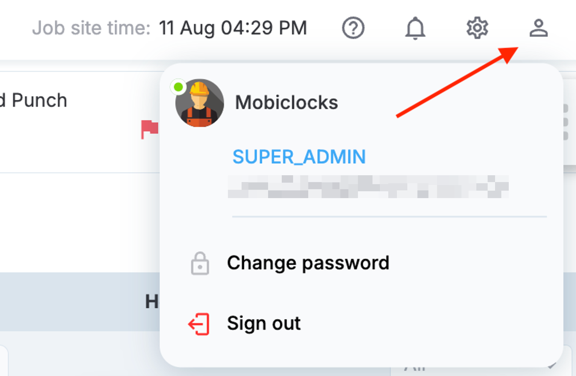
Profile info
Job site name in reports
We’ve added the job site name to the following reports:
- As a new field in the Time and Attendance report
- Inside the Job site # field in the Punch Details report
- Inside the Job site # field in the Employee Missed Punch report
- Inside the Job site # field in the Round Up Minutes report
- Inside the Job site # field in the Employee Roster report
Admin App
Employee timelogs
The employee timelogs section has been fully redesigned including a new date picker design, redesign of the whole timelogs table, and more. In particular, we’ve updated how Total, OT, DT, and SFT hours are shown above the table. The following screenshot shows the updated employee timelogs section.
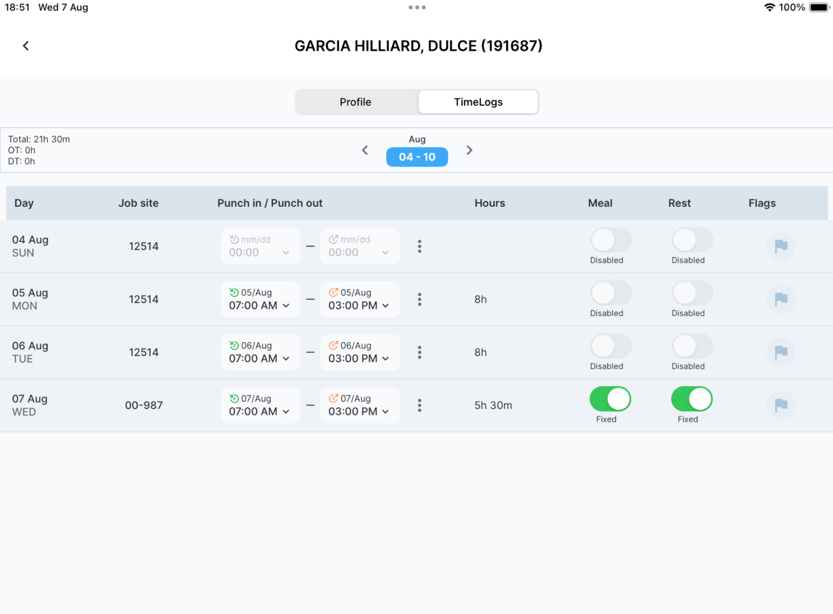
Employee timelogs
Kiosk App
Redesign
Some sections have been redesigned in the iOS version of the app. In particular, we’ve redesigned the punch-in and punch-out buttons and the time indicator as well as added a reset button to the footer. We’ve also redesigned the header in other screens such as pin punch and successful punch.
Personal App
Home screen
The home screen has been redesigned and has incorporated new features. In particular, the punch-in and punch-out buttons have been redesigned. The Change button for switching the job site when punched in has been redesigned and renamed to Switch job site.
Now employees can expand the job site area at the bottom of the screen by swiping it up and view their timelog history for the job site.
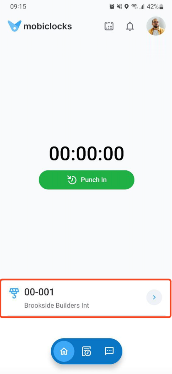
Job site area
The Out of geofence alerts have been redesigned, as shown in the following screenshot.
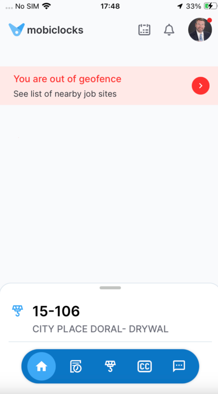
Out of geofence alert
Job site selection
Some UI changes have been made to the job site selection screen, and a map icon has been added next to each job site entry. Tapping the icon takes you to your device’s maps application, redirecting you to the geofence area on the map. Currently, this feature is only available on the iOS version but will be added to Android soon.
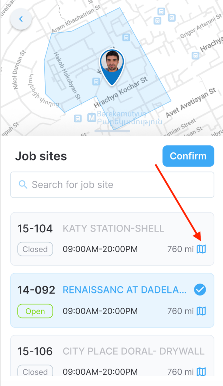
Map icon on a job site entry
Overview
We’ve added a new Overview tab in the Timecard section where employees and PM roles see weekly total hours, cost codes, and other useful information.
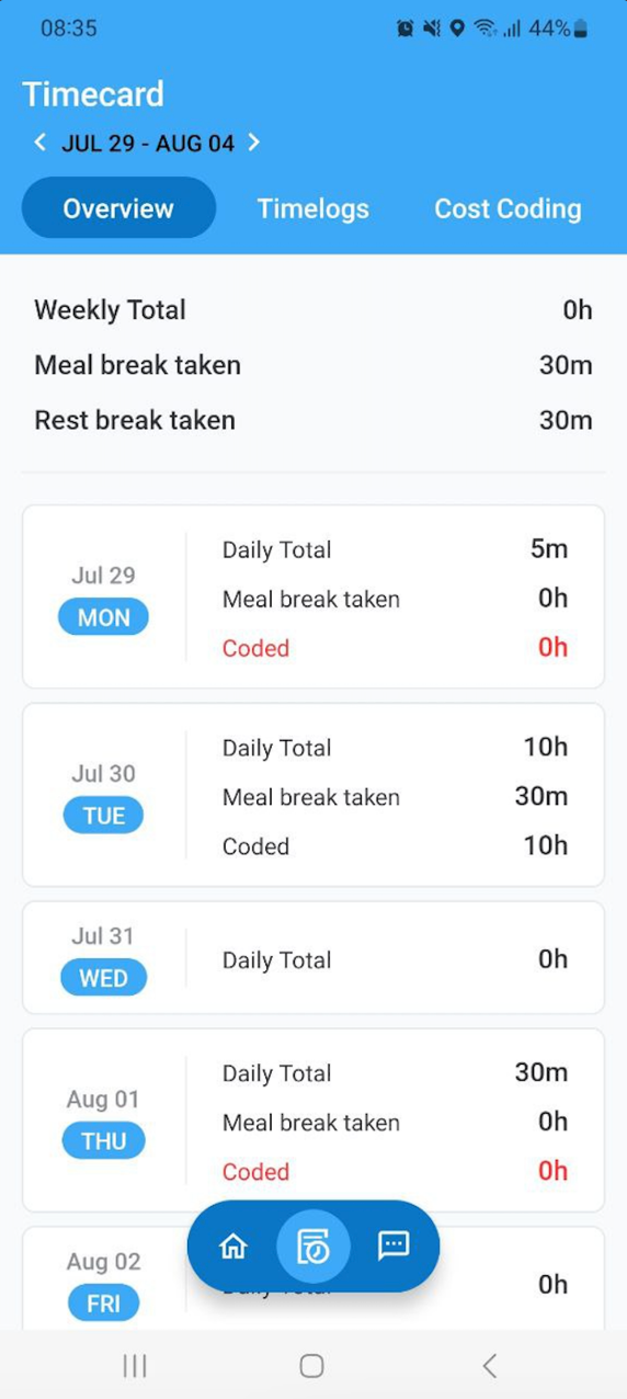
Overview tab
Cost coding
Self-cost coding for employees and PM roles has been moved to the Cost Coding tab in the Timecard section. The cost coding section accessed from the home screen is now only for crew cost coding available to PM roles.
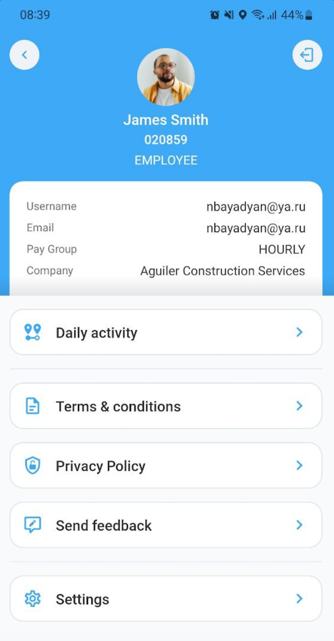
Account management
The account management screen has been redesigned.
Account management