
Design forms
How to build and customize your form.
The Designer section of the punch form creator provides a visual interface for building and customizing forms that employees complete during punch-in and punch-out processes. This drag-and-drop editor allows you to add, configure, and organize form elements.
Form builder interface
The form builder consists of three main areas:
- Toolbox (left sidebar): Contains all available field types that you can add to your form
- Design canvas (center): Displays your form layout where you can add, arrange, and edit form elements
- Properties panel (right sidebar): Shows configuration options for the selected form element
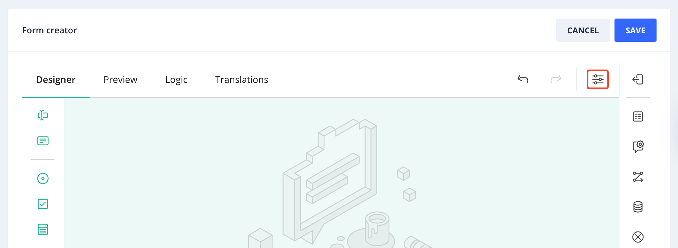
Survey settings
Survey settings control global properties that apply to the entire punch form. They are accessed from the settings icon at the top of the form builder, as highlighted in the following screenshot.
Accessing survey settings
The following settings are available:
- Make the survey read-only: When enabled, displays the entire form to employees but prevents them from editing any fields or submitting responses.
- Select a survey language: Sets the default language for the form. If translations are configured, this determines which language version employees see by default. See Translate forms to learn more.
- Limit to one response: Restricts the number of times the form can be submitted. Enter a time period (such as
24 hoursor1 day) to prevent duplicate submissions within that timeframe. - Survey width mode: Controls how the form adapts to different screen sizes. Options include:
- Auto: Automatically adjusts form width based on content and screen size
- Static: Uses a fixed width regardless of screen size
- Responsive: Dynamically adjusts to fit the available screen width
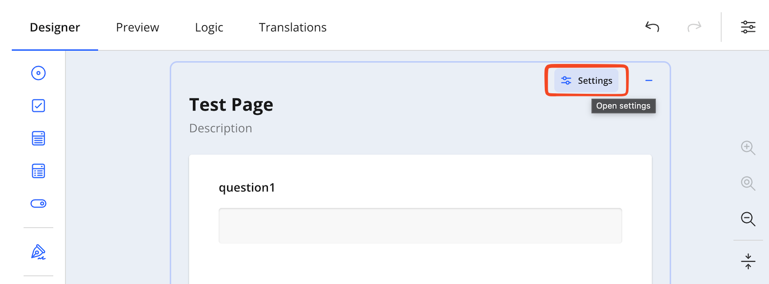
Page management
Page settings control the properties and behavior of the form page. To access page settings, hover over the page and select Settings, as highlighted in the following screenshot.
Accessing page settings
The following page settings are available:
- Page name: The internal identifier used to reference this page in logic rules and navigation. Page names must be unique within the form.
- Page title: The heading displayed at the top of the page. Use descriptive titles that clearly indicate the page's purpose or content section.
- Page description: Optional text that appears below the page title to provide context or instructions for the questions on this page.
- Visible: Controls whether the page appears in the form. Use with logic rules to show or hide entire pages based on employee responses.
- Read-only: When enabled, displays all page content to employees but prevents them from editing any fields on the page.
- Navigation title: The text displayed in page navigation elements such as progress indicators or page selectors. If left empty, the page title is used.
Add form elements
To add a field to your form:
- In the left toolbox, select the field type you want to add.
- Either click the field type to add it to the canvas, or drag it to a specific position on the form.
- The new field appears on the design canvas with a default name (for example, "question1").
Configure field settings
Each form element includes configuration options accessible through the field's action buttons:
- Settings: Opens the properties panel where you can customize the field's name, title, description, validation rules, and other options. See Available field types for a detailed breakdown of each field's settings.
- Required: Toggles whether the field must be completed before form submission
- Delete: Removes the field from the form
NOTEChanges made in the Designer are automatically saved. Use the Preview tab to test your form before activating it for employees.
Available field types
The form builder provides the following field types for creating punch forms:
Single-Line Input
Use Single-line input for short, single-line responses such as employee numbers. Long text fields allow multi-line text entry for longer responses like shift notes or incident descriptions.
Settings
- Question name: The internal identifier used to reference this field in logic rules and data exports. This value is not visible to employees.
- Question title: The label displayed to employees above the input field.
- Question description: Optional explanatory text that appears below the question title to provide additional context or instructions.
- Visible: Controls whether the field appears on the form. Use with logic rules to show or hide fields based on other responses.
- Read-only: Displays the field to employees but prevents them from editing the value.
- Required: When enabled, employees must complete this field before submitting the form.
- Show the title and description: Controls the visibility of the question title and description text.
- Input type: Specifies the type of data the field accepts (Text, Email, Number, Tel, or URL). Selecting the appropriate type enables device-specific keyboards and automatic validation.
- Placeholder text within input field: Optional text that appears inside the input field when empty. Placeholder text disappears when employees begin typing.
- Autocomplete type: Enables browser autocomplete functionality to suggest previously entered values for common information types.
- Items for auto-suggest: A list of predefined suggestions that appear as employees type. Enter each suggestion on a separate line.
Layout
The Layout settings section controls the visual presentation and positioning of the field.
- Display the question on a new line: When enabled, forces the question to start on a new line rather than appearing inline with previous elements.
- Question box collapse state: Controls the initial display state of the question container. Options include:
- Locked: Always expanded and cannot be collapsed
- Collapsed: Initially minimized, expandable by employees
- Expanded: Initially visible, collapsible by employees
- Question title alignment: Sets the horizontal alignment of the question title text (Left, Center, Right, or Inherit from parent settings).
- Question description alignment: Sets the horizontal alignment of the question description text (Left, Center, Right, or Inherit from parent settings).
- Error message alignment: Controls where validation error messages appear relative to the input field (Inherit, Top, or Bottom).
- Increase the inner indent: Adds left padding to the question content. Select from 0 to 3 levels of indentation to create visual hierarchy.
- Inline question width: Specifies the width of the question when displayed inline with other elements. Use CSS units such as pixels (px), inches (in), or percentages (%).
- Minimum question width: Sets the minimum width constraint for the question container. Default is
300px. - Maximum question width: Sets the maximum width constraint for the question container. Default is
100%. - Input field width (in characters): Controls the visual width of the input field based on the number of characters. Leave empty to use automatic sizing.
- Input value alignment: Sets the horizontal alignment of text entered by employees within the input field (Left, Right, or Auto).
Long text
Use Long text fields for multi-line text entry such as shift notes, incident descriptions, or detailed comments.
Settings
- Question name: The internal identifier used to reference this field in logic rules and data exports. This value is not visible to employees.
- Question title: The label displayed to employees above the text area.
- Question description: Optional explanatory text that appears below the question title to provide additional context or instructions.
- Visible: Controls whether the field appears on the form. Use with logic rules to show or hide fields based on other responses.
- Read-only: Displays the field to employees but prevents them from editing the value.
- Required: When enabled, employees must complete this field before submitting the form.
- Show the title and description: Controls the visibility of the question title and description text.
- Placeholder text within input field: Optional text that appears inside the text area when empty. Placeholder text disappears when employees begin typing.
Layout
The Layout settings section controls the visual presentation and positioning of the field.
- Question description alignment: Sets the horizontal alignment of the question description text (Left, Center, Right, or Inherit from parent settings).
- Error message alignment: Controls where validation error messages appear relative to the text area (Inherit, Top, or Bottom).
- Increase the inner indent: Adds left padding to the question content. Select from 0 to 3 levels of indentation to create visual hierarchy.
- Inline question width: Specifies the width of the question when displayed inline with other elements. Use CSS units such as pixels (px), inches (in), or percentages (%).
- Minimum question width: Sets the minimum width constraint for the question container. Default is
300px. - Maximum question width: Sets the maximum width constraint for the question container. Default is
100%. - Input field height (in lines): Controls the initial height of the text area based on the number of text lines. Higher values provide more visible space for longer responses.
- Expand input field dynamically: Controls whether the text area automatically expands vertically as employees type (Inherit, Disabled, or Enabled).
- Enable resize handle: Controls whether employees can manually resize the text area by dragging a handle (Inherit, Disabled, or Enabled).
Radio button group
Use Radio button group fields when employees need to select a single option from a predefined list of choices.
To configure choices for a radio button group, select the field on the design canvas. The choices editor appears inline, allowing you to add, edit, and reorder options. Click Add Item to create new choices, or click existing choices to edit their display text and values. Use the drag handles to reorder choices, and click the delete icon to remove options.
Settings
- Question name: The internal identifier used to reference this field in logic rules and data exports. This value is not visible to employees.
- Question title: The label displayed to employees above the radio button options.
- Question description: Optional explanatory text that appears below the question title to provide additional context or instructions.
- Visible: Controls whether the field appears on the form. Use with logic rules to show or hide fields based on other responses.
- Read-only: Displays the field to employees but prevents them from selecting any options.
- Required: When enabled, employees must select an option before submitting the form.
- Show the title and description: Controls the visibility of the question title and description text.
- Add a comment box: When enabled, adds a text input field below the radio buttons where employees can provide additional comments or explanations.
Layout
- Display the question on a new line: When enabled, forces the question to start on a new line rather than appearing inline with previous elements.
- Question box collapse state: Controls the initial display state of the question container. Options include:
- Locked: Always expanded and cannot be collapsed
- Collapsed: Initially minimized, expandable by employees
- Expanded: Initially visible, collapsible by employees
- Question title alignment: Sets the horizontal alignment of the question title text (Left, Center, Right, or Inherit from parent settings).
- Question description alignment: Sets the horizontal alignment of the question description text (Left, Center, Right, or Inherit from parent settings).
- Error message alignment: Controls where validation error messages appear relative to the radio button group (Inherit, Top, or Bottom).
- Increase the inner indent: Adds left padding to the question content. Select from 0 to 3 levels of indentation to create visual hierarchy.
- Inline question width: Specifies the width of the question when displayed inline with other elements. Use CSS units such as pixels (px), inches (in), or percentages (%).
- Minimum question width: Sets the minimum width constraint for the question container. Default is
300px. - Maximum question width: Sets the maximum width constraint for the question container. Default is
100%. - Column count: Controls how many columns the radio button options are arranged in. Higher values display options in a multi-column layout to save vertical space.
Checkboxes
Use Checkboxes fields when employees need to select one or more options from a predefined list of choices.
To configure choices for a checkboxes field, select the field on the design canvas. The choices editor appears inline, allowing you to add, edit, and reorder options. Click Add Item to create new choices, or click existing choices to edit their display text and values. Use the drag handles to reorder choices, and click the delete icon to remove options.
Settings
- Question name: The internal identifier used to reference this field in logic rules and data exports. This value is not visible to employees.
- Question title: The label displayed to employees above the checkbox options.
- Question description: Optional explanatory text that appears below the question title to provide additional context or instructions.
- Visible: Controls whether the field appears on the form. Use with logic rules to show or hide fields based on other responses.
- Read-only: Displays the field to employees but prevents them from selecting any options.
- Required: When enabled, employees must select at least one option before submitting the form.
- Show the title and description: Controls the visibility of the question title and description text.
- Add a comment box: When enabled, adds a text input field below the checkboxes where employees can provide additional comments or explanations.
Layout
The Layout settings section controls the visual presentation and positioning of the field.
- Display the question on a new line: When enabled, forces the question to start on a new line rather than appearing inline with previous elements.
- Question box collapse state: Controls the initial display state of the question container. Options include:
- Locked: Always expanded and cannot be collapsed
- Collapsed: Initially minimized, expandable by employees
- Expanded: Initially visible, collapsible by employees
- Question title alignment: Sets the horizontal alignment of the question title text (Left, Center, Right, or Inherit from parent settings).
- Question description alignment: Sets the horizontal alignment of the question description text (Left, Center, Right, or Inherit from parent settings).
- Error message alignment: Controls where validation error messages appear relative to the checkbox group (Inherit, Top, or Bottom).
- Increase the inner indent: Adds left padding to the question content. Select from 0 to 3 levels of indentation to create visual hierarchy.
- Inline question width: Specifies the width of the question when displayed inline with other elements. Use CSS units such as pixels (px), inches (in), or percentages (%).
- Minimum question width: Sets the minimum width constraint for the question container. Default is
300px. - Maximum question width: Sets the maximum width constraint for the question container. Default is
100%. - Column count: Controls how many columns the checkbox options are arranged in. Higher values display options in a multi-column layout to save vertical space.
Dropdown and Multi-Select Dropdown
Use Dropdown fields when employees need to select a single option from a list. For multiple selections, use the Multi-Select Dropdown field, which allows employees to choose more than one option from the same list.
To configure choices for a dropdown field, select the field on the design canvas. The choices editor appears inline, displaying all available options. Click Add Item to create new choices, or click existing choice labels to edit them. Use the + and − icons next to each item to add or remove individual options, and use drag handles to reorder them. The multi-select dropdown also includes a Select All option at the top of the list, allowing employees to select all available choices at once.
Settings
- Question name: The internal identifier used to reference this field in logic rules and data exports. This value is not visible to employees.
- Question title: The label displayed to employees above the dropdown.
- Question description: Optional explanatory text that appears below the question title to provide additional context or instructions.
- Visible: Controls whether the field appears on the form. Use with logic rules to show or hide fields based on other responses.
- Read-only: Displays the field to employees but prevents them from selecting any options.
- Required: When enabled, employees must select an option before submitting the form.
- Show the title and description: Controls the visibility of the question title and description text.
- Add a comment box: When enabled, adds a text input field below the dropdown where employees can provide additional comments or explanations.
- Collapse the dropdown upon selection (Multi-Select Only): When enabled, automatically closes the dropdown list after an employee selects an option.
- Placeholder text within input field: Optional text displayed inside the dropdown when no option is selected. Default is
Select.... - Autocomplete type: Enables browser autocomplete functionality to suggest previously entered values for common information types.
Layout
The Layout settings section controls the visual presentation and positioning of the field.
- Display the question on a new line: When enabled, forces the question to start on a new line rather than appearing inline with previous elements.
- Question box collapse state: Controls the initial display state of the question container. Options include:
- Locked: Always expanded and cannot be collapsed
- Collapsed: Initially minimized, expandable by employees
- Expanded: Initially visible, collapsible by employees
- Question title alignment: Sets the horizontal alignment of the question title text (Left, Center, Right, or Inherit from parent settings).
- Question description alignment: Sets the horizontal alignment of the question description text (Left, Center, Right, or Inherit from parent settings).
- Error message alignment: Controls where validation error messages appear relative to the dropdown (Inherit, Top, or Bottom).
- Increase the inner indent: Adds left padding to the question content. Select from 0 to 3 levels of indentation to create visual hierarchy.
- Inline question width: Specifies the width of the question when displayed inline with other elements. Use CSS units such as pixels (px), inches (in), or percentages (%).
- Minimum question width: Sets the minimum width constraint for the question container. Default is
300px. - Maximum question width: Sets the maximum width constraint for the question container. Default is
100%. - Column count: Controls how many columns the dropdown options are arranged in when the list is expanded. Higher values display options in a multi-column layout to save vertical space.
Yes/No (Boolean)
Use Yes/No fields for binary true/false questions such as "Did you complete your safety check?" or "Are you working overtime?". The field renders as a toggle switch that employees can flip between two states.
To configure a Yes/No field, select it on the design canvas. The toggle displays two customizable labels representing the true and false states. Click the field to open its settings and update the label text to match your specific question context.
Settings
- Question name: The internal identifier used to reference this field in logic rules and data exports. This value is not visible to employees.
- Question title: The label displayed to employees above the toggle.
- Question description: Optional explanatory text that appears below the question title to provide additional context or instructions.
- Visible: Controls whether the field appears on the form. Use with logic rules to show or hide fields based on other responses.
- Read-only: Displays the field to employees but prevents them from changing the toggle state.
- Required: When enabled, employees must interact with the toggle before submitting the form.
- Show the title and description: Controls the visibility of the question title and description text.
- Add a comment box: When enabled, adds a text input field below the toggle where employees can provide additional comments or explanations.
- Label for "True": The text displayed for the affirmative state of the toggle (for example, "Yes" or "Completed").
- Label for "False": The text displayed for the negative state of the toggle (for example, "No" or "Not completed").
Layout
The Layout settings section controls the visual presentation and positioning of the field.
- Display the question on a new line: When enabled, forces the question to start on a new line rather than appearing inline with previous elements.
- Question box collapse state: Controls the initial display state of the question container. Options include:
- Locked: Always expanded and cannot be collapsed
- Collapsed: Initially minimized, expandable by employees
- Expanded: Initially visible, collapsible by employees
- Question title alignment: Sets the horizontal alignment of the question title text (Left, Center, Right, or Inherit from parent settings).
- Question description alignment: Sets the horizontal alignment of the question description text (Left, Center, Right, or Inherit from parent settings).
- Error message alignment: Controls where validation error messages appear relative to the toggle (Inherit, Top, or Bottom).
- Increase the inner indent: Adds left padding to the question content. Select from 0 to 3 levels of indentation to create visual hierarchy.
- Inline question width: Specifies the width of the question when displayed inline with other elements. Use CSS units such as pixels (px), inches (in), or percentages (%).
- Minimum question width: Sets the minimum width constraint for the question container. Default is
300px. - Maximum question width: Sets the maximum width constraint for the question container. Default is
100%.
Signature
Use Signature fields to capture employee digital signatures during punch-in and punch-out processes. Signature fields are ideal for shift acknowledgments, safety confirmations, or any compliance documentation that requires employee authorization.
To configure a signature field, select it on the design canvas. The signature area appears inline displaying a "Sign here" placeholder. Use the field settings to adjust the canvas dimensions, appearance, and storage format to suit your form's requirements.
Settings
- Question name: The internal identifier used to reference this field in logic rules and data exports. This value is not visible to employees.
- Question title: The label displayed to employees above the signature area.
- Question description: Optional explanatory text that appears below the question title to provide additional context or instructions.
- Visible: Controls whether the field appears on the form. Use with logic rules to show or hide fields based on other responses.
- Read-only: Displays the signature area to employees but prevents them from drawing a signature.
- Required: When enabled, employees must provide a signature before submitting the form.
- Show the title and description: Controls the visibility of the question title and description text.
- Signature area width: Sets the width of the signature canvas in pixels. Default is
300. - Signature area height: Sets the height of the signature canvas in pixels. Default is
200. - Auto-scale the signature area: When enabled, automatically adjusts the signature canvas to fit the available width of the form.
- Show a placeholder within signature area: When enabled, displays placeholder text inside the signature canvas to guide employees.
- Placeholder text: The text displayed inside the signature area when empty (for example, "Sign here").
- Placeholder text in read-only or preview mode: The text displayed inside the signature area when it is empty and the field is in read-only or preview mode. Default is
No signature. - Show the Clear button within signature area: When enabled, displays a button that allows employees to erase their signature and start over.
- Background image: An optional image displayed behind the signature area. Enter a file path or URL, or select a file using the file picker.
- Background color: Sets the background color of the signature canvas.
- Minimum stroke width: Sets the minimum thickness of the signature line in pixels. Default is
0,5. - Maximum stroke width: Sets the maximum thickness of the signature line in pixels. Default is
2,5. - Stroke color: Sets the color of the signature line drawn by employees.
- Wait for upload to complete: When enabled, prevents form submission until the signature image has finished uploading to the server.
Layout
The Layout settings section controls the visual presentation and positioning of the field.
- Display the question on a new line: When enabled, forces the question to start on a new line rather than appearing inline with previous elements.
- Question box collapse state: Controls the initial display state of the question container. Options include:
- Locked: Always expanded and cannot be collapsed
- Collapsed: Initially minimized, expandable by employees
- Expanded: Initially visible, collapsible by employees
- Question title alignment: Sets the horizontal alignment of the question title text (Left, Center, Right, or Inherit from parent settings).
- Question description alignment: Sets the horizontal alignment of the question description text (Left, Center, Right, or Inherit from parent settings).
- Error message alignment: Controls where validation error messages appear relative to the signature area (Inherit, Top, or Bottom).
- Increase the inner indent: Adds left padding to the question content. Select from 0 to 3 levels of indentation to create visual hierarchy.
- Inline question width: Specifies the width of the question when displayed inline with other elements. Use CSS units such as pixels (px), inches (in), or percentages (%).
- Minimum question width: Sets the minimum width constraint for the question container. Default is
300px. - Maximum question width: Sets the maximum width constraint for the question container. Default is
100%.
Disclaimer
Use Disclaimer fields to present policy or compliance text that employees must explicitly acknowledge before submitting the form. The field displays a block of text followed by a checkbox that employees must select to confirm they have read and understood the content. Disclaimer fields are ideal for safety policies, terms of employment, or any statement requiring documented employee acknowledgment. In Kiosk App, the disclaimer is shown under the punch buttons as plain text.
Settings
- Question name: The internal identifier used to reference this field in logic rules and data exports. This value is not visible to employees.
- Question title: The heading displayed above the disclaimer text (for example, "Disclaimer" or "Safety policy acknowledgment").
- Question description: The full disclaimer text displayed to employees. Enter the complete policy or compliance statement that employees must read before acknowledging.
- Visible: Controls whether the field appears on the form. Use with logic rules to show or hide the field based on other responses.
- Read-only: Displays the disclaimer and checkbox to employees but prevents them from interacting with it.
- Required: When enabled, employees must check the acknowledgment checkbox before submitting the form. Enabled by default.
- Show the title and description: Controls the visibility of the question title and description text.
- Add a comment box: When enabled, adds a text input field below the acknowledgment checkbox where employees can provide additional comments.
Layout
The Layout settings section controls the visual presentation and positioning of the field.
- Display the question on a new line: When enabled, forces the field to start on a new line rather than appearing inline with previous elements.
- Question box collapse state: Controls the initial display state of the question container. Options include:
- Locked: Always expanded and cannot be collapsed
- Collapsed: Initially minimized, expandable by employees
- Expanded: Initially visible, collapsible by employees
- Question title alignment: Sets the horizontal alignment of the question title text (Left, Center, Right, or Inherit from parent settings).
- Question description alignment: Sets the horizontal alignment of the disclaimer text (Left, Center, Right, or Inherit from parent settings).
- Error message alignment: Controls where validation error messages appear relative to the field (Inherit, Top, or Bottom).
- Increase the inner indent: Adds left padding to the question content. Select from 0 to 3 levels of indentation to create visual hierarchy.
- Inline question width: Specifies the width of the field when displayed inline with other elements. Use CSS units such as pixels (px), inches (in), or percentages (%).
- Minimum question width: Sets the minimum width constraint for the question container. Default is
300px. - Maximum question width: Sets the maximum width constraint for the question container. Default is
100%. - Column count: Controls how many columns the acknowledgment options are arranged in when multiple accept options are configured.
Daily log
Use the Daily log field to capture shift-level notes from employees during the punch process. Text entered in this field is recorded in the Daily log tab of the corresponding timelog and can be viewed or edited from the Timelog details in Web App. Note that a form can contain only one Daily log field.
Settings
- Question name: The internal identifier used to reference this field in logic rules and data exports. This value is not visible to employees.
- Question title: The label displayed to employees above the text area. Default is
Daily log title. - Question description: Optional explanatory text that appears below the question title to provide additional context or instructions.
- Visible: Controls whether the field appears on the form. Use with logic rules to show or hide the field based on other responses.
- Read-only: Displays the field to employees but prevents them from entering text.
- Required: When enabled, employees must complete this field before submitting the form.
- Show the title and description: Controls the visibility of the question title and description text.
- Placeholder text within input field: Optional text that appears inside the text area when empty. Default is
add your log. Placeholder text disappears when employees begin typing.
Layout
The Layout settings section controls the visual presentation and positioning of the field.
- Question description alignment: Sets the horizontal alignment of the question description text (Left, Center, Right, or Inherit from parent settings).
- Error message alignment: Controls where validation error messages appear relative to the text area (Inherit, Top, or Bottom).
- Increase the inner indent: Adds left padding to the question content. Select from 0 to 3 levels of indentation to create visual hierarchy.
- Inline question width: Specifies the width of the question when displayed inline with other elements. Use CSS units such as pixels (px), inches (in), or percentages (%).
- Minimum question width: Sets the minimum width constraint for the question container. Default is
300px. - Maximum question width: Sets the maximum width constraint for the question container. Default is
100%. - Input field height (in lines): Controls the initial height of the text area based on the number of text lines. Default is
4. - Expand input field dynamically: Controls whether the text area automatically expands vertically as employees type (Inherit, Disabled, or Enabled).
- Enable resize handle: Controls whether employees can manually resize the text area by dragging a handle (Inherit, Disabled, or Enabled).
Updated 3 months ago